small lessons in user experience
User experience is really one of the primary drivers of information design. In this case, Motorola has gone out of its way to have the new cable set top box be helpful to its new owner.
Having been properly connected to a working cable feed as well as your TV and powered up, the next logical step is to help the uninitiated consumer with what needs to happen next to make all this magic work. So, brilliantly, the HD cable box displays everything there is to know about itself and its configuration and tells you exactly what you need to do. It does so in no uncertain terms and in letters 4 inches tall.
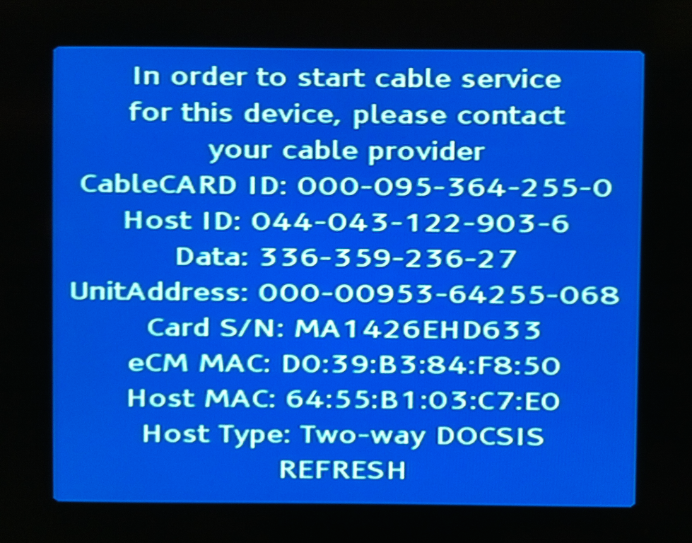
This is a good effort on part of the set top equipment, but despite all the detailed information the two pieces of information you need in order to bring your HD cable to life are missing:
- the cable company's phone number to call
- the magic serial number identifying the box to the cable company, found only in tiny print (and bar code) on the back of the card board box now in recycling
This is especially baffling considering that you are not ready to call the cable company until you get this far, and that most single self-installs will pass through this point.
What would this process look like if somebody was to sit down and plan it end to end, taking into account the whole experience from purchase decision to couch with remote in hand? I bet it would involve less than half a dozen set top box reboots. Then again, is there much motivation for that (on part of the vendor), given the available cable alternatives?